![]()
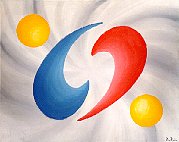
| This is one of my oldest and best
paintings. I cannot get a better scan than this because the color red does
not come out right with scanning. The image has been retouched in the red
area to show shading not visible under ordinary scanning. Getting the curves
right was very hard to do because they are over two feet across and even
the most minor imperfection especially in the outer curves, a millimeter
or less too wide or narrow, would immediately draw ones sight to it. Not
the most difficult thing to paint, not as hard as portrait painting, but
still took a great deal of skill which so called great artists who fill
museums with crap like all black or all white canvases might wish to try
doing instead of making paintings that a chimp could do a better job at,
which is probably why chimps and gorillas have paintings in galleries now,
they show more skill than some human artists. I am pretty sure a chimp
could not reproduce this design and get the curves perfectly straight or
the shading right.
To some people this painting above looks like the Chinese ying/yang symbol. I will put a badly drawn one here to 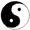 demonstrate
what I mean. Since some flags, I think Korea is one, have the symbol below
in red and blue instead of the traditional black and white like I show
it here, and that the red/blue shapes in the painting approximate a circle,
this probably makes that design spring to mind. The ying/yang symbol is
in the painting but in the negative space between the red and the blue
shapes. That the ying/yang shapes are formless in the painting and blend
right into the background, and are only defined at all by the red and blue
shapes surrounding them, are meant to represent souls, identical in nature
to each other and with all else in the universe, appearing to touch with
intertwining of the red and blue (male and female) forms. It is the formless
using forms to touch even though formless things aren't supposed to be
able to touch. demonstrate
what I mean. Since some flags, I think Korea is one, have the symbol below
in red and blue instead of the traditional black and white like I show
it here, and that the red/blue shapes in the painting approximate a circle,
this probably makes that design spring to mind. The ying/yang symbol is
in the painting but in the negative space between the red and the blue
shapes. That the ying/yang shapes are formless in the painting and blend
right into the background, and are only defined at all by the red and blue
shapes surrounding them, are meant to represent souls, identical in nature
to each other and with all else in the universe, appearing to touch with
intertwining of the red and blue (male and female) forms. It is the formless
using forms to touch even though formless things aren't supposed to be
able to touch.
I don't think it was really meant to be that deep, but that is what I get out of it, and what I was thinking if I could be said to have been thinking of anything when it popped in my head. But if the all black, all white, or all any one color paintings in museums can be said to have some higher meaning (they would have to get some idiot to pay tons of money for something anyone could do), this ones meaning is at least right there visible in the painting and not entirely BS. The yellow balls are just there to give it balance. If enough people ask for prints of it, (the original is poster sized) I will have some made up on a limited basis. Since with new technology, it is now possible to scan an entire painting directly to make an exact full color computer print from the original, I will try playing around with this process to see if I can make prints as good as the original. In bright light on a white wall it is really impressive. When going over the notebooks I found what I think was an original sketch of what it was going to be. I have links to that below, and to its use in the logo for Scandere Software programs between 1996 and 1999.
|